Posted in Design

Growing Twitter Design

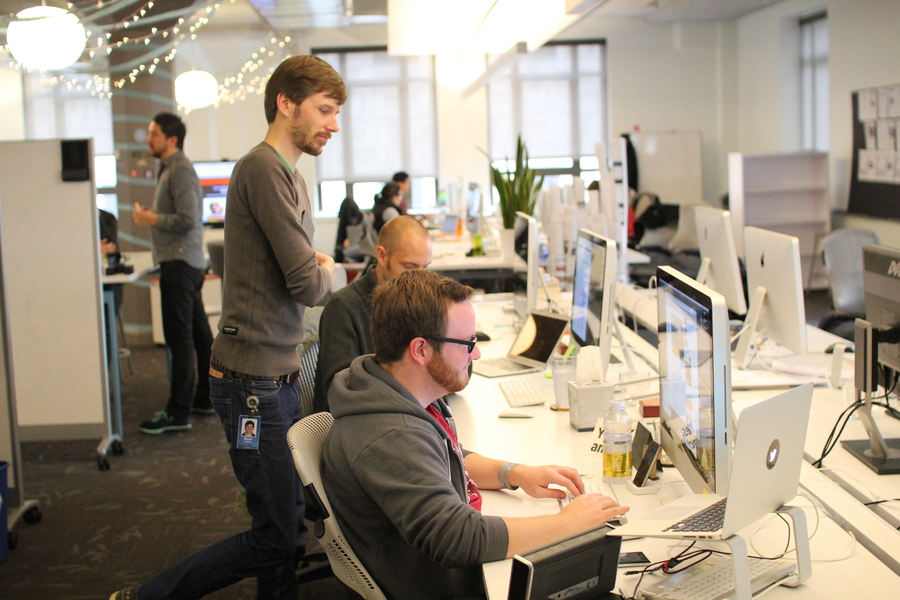
First, the whole point of this post. We’re expanding the Twitter Design Studio. Whether you’ve ever thought about working at Twitter or not, think about it now. We have a few open spots that we’re looking to fill in the next couple months. One of the desks in this photo of our studio could be yours. If we run out of space, we’ll make room for you.


Critiquing by @design

What we’ve been up to

We post samples of recent work on our Dribbble account. We’ve started posting photos of the studio and the team on 500px. (Some are embedded here in this post.) And, of course, we tweet too, from our team account, and all our personal accounts. Want to know more? Ask me or anyone on the team anytime. Here’s a tip: the service on which we all work makes us all easily contactable. We’re a pretty open bunch, and we’ll answer any questions as openly and honestly as we can. continued

Avoiding the Uncanny Valley of Interface Design

From Francisco Inchauste, on the topic of UI that imitates realism:

It is so easy to love a certain effect and want to use that everywhere. Not all projects need to have the selections sitting on a perfectly lit wooden bookshelf. On one hand we want to be creative and make something that is appealing and can sell the product. On the other side we have to question the cost of that approach on the experience itself and balance style and function with purpose.

Introducing Typekit

Emphasis is my own…

As a Typekit user, you’ll have access to our library of high-quality fonts. Just add a line of JavaScript to your markup, tell us what fonts you want to use, and then craft your pages the way you always have. Except now you’ll be able to use real fonts. This really is going to change web design.

Also worth checking out, Jeff posted a preview of the Typekit home page yesterday. Looking forward to how this will change typography and design for the web.

Great Designs Should Be Experienced and Not Seen

The best design is that which does its job and stays out of the way. Jared Spool on invisible design:

While all these things are what the designers at Netflix work hard on every day, they go unmentioned by their customers. It’s not because these aspects aren’t important. It’s because the designers have done their job really well: they’ve made them invisible.

Choices

Craig directed me to this piece today after I complimented him on the new version of Twitterrific for the iPhone, stating how much I love seeing different approaches to Twitter client design. I hadn’t seen his post (from December 2008) before today, but it’s a good read that gives insight into some of the decisions behind Twitteriffic’s design that are still applicable now.

Personally, I welcome this competition. Seeing the work of other developers whose work I respect and admire acts as an inspiration. Looking at how other developers tackle a problem domain often adds insight into solving similar issues with my own code. In other cases, it shows me how I don’t want to implement a feature (without the need to prototype.) In short, competition will make Twitterrific better.

Time to move beyond 960?

Cameron asks the inevitable question about width on the Web. Probably not time yet for mainstream. But for showcases of design, why not start experimenting with the new real estate?

In Defense of Eye Candy

Stephen Anderson:

The more we learn about people, and how our brains process information, the more we learn the truth of that phrase: form and function aren’t separate items. If we believe that style somehow exists independent of functionality, that we can treat aesthetics and function as two separate pieces, then we ignore the evidence that beauty is much more than decoration. Our brains can’t help but agree.

Can’t say that I agree with all the examples he used. But important points that stand on their own, nonetheless.