For individuals who are neither designers nor artists, it may seem like those who are, use a lot of smoke and mirrors, magically whipping up each stunning creation. Artistic talent and creativity can certainly aid and enhance the final result, but design, in particular, generally follows a process. Each designer — or design group — develops a method for solving problems, then evolves that method over time. While no one person or group may view a problem from the same perspective, general similarities often appear in their approach.
 As I mentioned in a related log entry about my CSS Zen Garden submission, I thought it might be interesting to share the process I went through to create the design I titled Golden Mean. Designing one page for the Garden wasn’t a full-scale project, and definitely not done for a discerning client under contract or any type of compensation agreement. But about halfway through the creation of the piece, I noticed I was following a traditional (albeit somewhat condensed) process often used for larger projects. My process, specific to the Garden project, can be grouped into the following phases:
Research & Discovery
Jumping into any design project before examining the problem or task at hand might spin the wheels, but won’t get you very far. Any project, no matter how big or small, can benefit from research and planning before the work begins. Design is no exception. If discovery begins before the exploration commences, the probability of finding a successful direction for the project only increases. The amount of time spent on this phase is usually proportional to the overall scope and planned duration of the project.
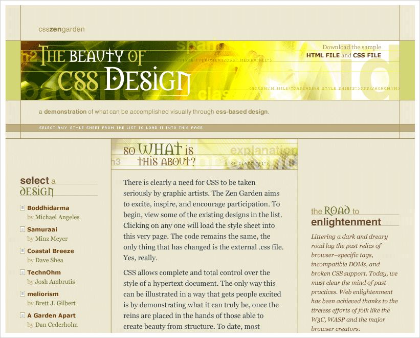
For the Garden design, I began by studying the content (text) of the existing page, making a model in my head of the document flow and hierarchy. I aggregated the sections of the page into logical groupings and assigned each a priority. I also spent time thinking about the purpose of the project, along with the ideas and concepts Dave Shea was trying to communicate when he created the Garden space and opened it up for other designers to contribute. Showing off advanced CSS trickery is not the goal of this project. Instead, it attempts to demonstrate the beauty and flexibility achievable when designers grasp all the potential of CSS, using it as a tool to create a well-designed aesthetically-pleasing page which remains accessible, well-structured, and efficiently coded.
Competitive Analysis
Another helpful task in the process involves looking at pre-existing ideas and executions created by peers, mentors, heros, and/or competitors. Competitive analysis identifies the strengths and weaknesses of those existing designs. It can reveal gaps which still need to be filled and shortcomings which should be met. The ability to study what others have designed for the same (or similar) problem lends a sizeable advantage, since a great deal can be learned from their successes and failures.
When I finally came across free time to start thinking about one of my own submissions, I had the advantage of being able to study many submissions which already resided in the Garden. I studied the concept and execution of each piece. I admired the cleverness and creativity of some of the existing designs. I noted similarities and differences between all of them. I sought out the characteristics which weren’t yet present.
Exploration
When tackling a design project with limitless creative boundaries, I like to begin by creating lists of relevant words, topics, and phrases. Sort of a free-form brainstorming of thoughts related to the project at hand. Some are abstract and loose, some are concrete and tightly related. By creating these lists, I try to gain a broadened perspective of the problem I’m attempting to solve, and often uncover additional ideas and concepts which weren’t so obvious at the outset. My Garden lists contained groupings of words and thoughts related to gardening, plants and flowers found in a garden, zen-like qualities, beauty and beautiful things, and characteristics of page design. I also created lists of all the elements, IDs, and classes used in Dave’s HTML, some of which made subtle appearances in the final design.
Thumbnail Sketching
 Once I exhausted the idea branching, I started drawing thumbnail sketches [.gif, 46 KB] on a pad of paper. Thumbnails are small sketches which can literally be as small as your thumbnail, or as big as a couple inches in width and/or height. Think of the kind of drawing that might be seen on a cocktail napkin. Thumbnails are intended to capture the basic ideas for page composition, like header placement, column structure, and text alignment without allowing the temptation to focus on small details too early in the process. They can be quickly sketched allowing rapid idea iteration. Don’t like the one that just took 30 seconds to draw? Start another one right beside it. To keep them general, it’s best to start with rather small sketches. Then slowly size them up as more details need to be worked out.
Typography
 Once I had a few rough compositions I liked, I began studying typefaces and letterforms. To me, typography is a crucial element in setting the formalness or informality of a design. Evocations of different typefaces are subliminal to most people, but a designer will go to great lengths to ensure the selection and construction of type complements the mood of the piece. The easiest way to examine the effect of different typefaces for this project was to create an Illustrator file, and begin setting “CSS Zen Garden” and “The Beauty of CSS Design” in multiple fonts [.gif, 28 KB]. I had an idea of what I wanted. I also have a rather high familiarity with lots of typefaces. But I wanted to explore all the possibilities. I was looking for something I thought characterized clever design. Something fun or unique which played to the ideas beginning to form in my head.
 I selected the final typeface — Morpheus — because of its beautiful letterforms [.gif, 18 KB]. The uniqueness of the M and N, the gothic arches of the A and U, the extensions of the K and R, the way specific letters intimately replicate numerical forms like the S and lower-case d, the decorative diamond which dots the lower-case i and graces the bowls of rounded letters such as the D, O, and Q. In addition to my affinity for the letterforms, the pronounced medieval style of the headline type created a perfect contrast with the sans-serif modernity of supporting keywords and titles which I set in Helvetica.
Imagery
Imagery is not always necessary in design. In fact, some of the most beautiful designs use type alone. However, selectively chosen photography or illustration can create enormous visual impact for a design, adding dimension, implication, and a deeper level of understanding far beyond a well-written headline or paragraph of text.
 My next step in the process was to research imagery which could be used as the foundation for background texture, and act as supporting visual content. The lists I created earlier in the Exploration phase helped provide direction and spawned additional ideas. After searching though my own stockpiles of digital photos and artwork, and a few external resources of royalty-free images, I selected several potential pieces which already possessed some of the layering I wanted to include in the artwork for the page. I chose to use a manipulated image of a daisy [© Copyright 2003 by Lee Pettet] as the base art for this Garden design.
I’ve long been a fan of layering type for the purposes of creating texture and added relevance. I also like combining text and imagery to achieve subtle variations in color and value. (For historical examples, see relevant portfolio pieces: 01, 02, 03). Just as with other pieces I’ve created, I built up the Garden type over time, taking it through a deliberate process of addition, subtraction, and manipulation.
Composition
I tend to keep imagery confined to a particular region of the layout, or reserve it for a specific purpose. In my opinion, the overuse of photography or illustration can quickly create a crowded, chaotic design which just obscures the intention or message of the piece. Contrast is an element of design which I love to work with when creating anything visual. This comes just as much into play with use of imagery in a composition as it does within the image itself. Effectively integrating imagery into a design requires an awareness of balance and tension. Compact areas of motion and activity, countered with spaces for the eye to rest and relax.
 With a few rough comp ideas sketched out, and initial choices for typeface and imagery made, I began combining them in more developed digital sketches. Flipping back and forth between Illustrator and Photoshop, importing art from one into the other, the design was pushed closer and closer to it’s final mocked-up state. When designing outside HTML and CSS, I focus on constructing the language and guidelines of the page, determining proportions, widths and heights, gutters and white space, specifying complementing typefaces, choosing relative type size and leading, and the application of color as a means of both obvious and subtle accent.
Execution & Implementation
I’ve already covered some of the issues I encountered when constructing the CSS for this Garden submission. (See the related log entry for details.) I started writing the CSS for the design at a high-level, focusing on the layout structure, major backgrounds, and large regions of the page. Groups of elements were positioned in correct locations. Then I applied the necessary detail to each element, from the top of the page, down.
As I composed the style sheet and tested the page in various browsers, the design changed in small ways. Some changes were sacrifices. Some were evolved improvements. The addition of a background pattern to the left and right of the primary image was an added benefit of discovering I couldn’t position the header as I originally intended. The vertical alignment wasn’t refined until after each column was already positioned on the page. (The left and right columns were originally staggered in vertical starting position.)
These changes were possible because I, as the designer and style sheet author, could make decisions on the fly about what was important to recreate exactly, what could bend a little, and where the flexibility existed for the design to evolve as it was coded. This unity of thought at the final stage of the process is a strong reason the designer and person responsible for generating the HTML and/or CSS need should be working together as closely as possible, if the two are not already the same person.
And More
Although this is where I stopped for the CSS Zen Garden submission, the ever-changing design process does not end here. This summary is not an exhaustive one. Additional review and approval cycles, more design iterations, and frequent user testing all may be inserted anywhere into this process. It’s not always predictable, and may not always function like clockwork. But unless a designer is working for an illusionist, design is certainly not a magical combination of smoke and mirrors either. Maybe just a sleight-of-hand now and then.
Note: This article also exists in French at Pompage.net, translated (with permission) by Stéphane Deschamps: Les coulisses d’un design.