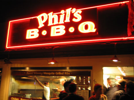
Picking up where we left off a couple weeks ago, I direct your attention to the header for the Examples section. (And no, you’re not just imagining a drastic shift if you looked at it soon after the redesign. I did change the background of the page from dark to light.) The original photo for this header image was taken during a recent trip down to San Diego, where good friends, Jason and Megan, took me to one of the best barbecue spots in the country… Phil’s BBQ:
This entry should pull a few of San Diego readers out of the woodwork. If you’ve been to Phil’s, you know exactly what I’m talking about. Sometimes up to an hour and half wait, but worth every minute of it. This is the type of place that could almost convert vegetarians into carnivores, at least temporarily. The barbecue sauce alone is enough to make the mouth water uncontrollably.
I love to study the type of signage on retail establishments and in public places. So I frequently carry a camera with me so I can capture typography that intrigues me. This photo was taken with an intent to focus on the neon signage above the front entrance. But the action below at the entrance and front window of Phil’s is what grabbed my interest, and became the inpiration for the Examples header. The relationship between barbecue and these public examples? If I gave one, it would be made up — there is none. This is just about friends, fun, and mouth-watering, finger-lickin’ grub.
