With a bit of humility and even a little nervousness, it’s time to take the wraps off a new design I’ve been working on for nearly a month. My hesitation comes not from revealing the new design, but from my decision early on to make the site more personal, and feel less like an “agency”. I also hesitate because of the elephant in the room: the fact that, up until now, my writing here trickled down to a few entries a year. continued
Posted in Site
Swing low
Getting back into the swing of writing regularly here never really happened in 2006. When I look back at my archives, I see I only posted 11 times the entire year. And that includes three posts (1, 2, 3) that weren’t really writing-based, as much as they were simple design and code experiments. continued
Change
Remain
The more you see, the less you know
The less you find out as you go
I knew much more then, than I do now
—Bono, City of Blinding Lights
Feedburning
Turns out I’m not the only one who’s been thinking about XML syndication feeds, publishing redundancy, and how we link to those feeds. Dan Cederholm was wondering last week why we still support multiple feed formats. A few weeks before, Molly Holzschlag surveyed a few sites to determine how they link to respective feeds, and where those links are located on the page. continued
The flop
Prior to seeing The flop, you make judgements as to how strong your hand could be based on two cards dealt to you, face-down. You peek at the cards, calculate the odds, then call, raise, or fold, knowing the flop is coming. Remember, the flop can change everything in an instant. Just don’t get too cocky, because a turn and a river are potentially just around the bend. continued
Flavor saver
With the return of the full-color, fixed-width design to this site over the weekend, Stopdesign received numerous messages and even a few comments regarding the switch back. Some of the messages and comments are in favor, heralding the welcome return. Others cry foul as their Bleach is stolen away.
“More power to the people!”
… the crowds shout from all around. And just like that, their wish was granted. continued
Liquid Bleach
Introducing Bleached
Ever wanted to ditch what you’ve got and start over? No, wait a minute. This sounds like a broken record.
Ahem. Let’s try that again.
Ever wondered what your site would look like devoid of most of its color and imagery? Bleach the entire design, remove the saturation and leave behind the basic visual structure on a stark white background? Sure, some sites already use a white background for their design. But Stopdesign has been filled with deep colors and prominent header images since I launched this design a few months ago. continued
On dissidence
By now, many of you may have seen François Briatte’s recent survey of 10 web sites he reads on a regular basis. My props to François for assembling an insanely detailed, and very well documented and explained study.
Perhaps you’ve also already seen responses by Jon, Dave, and Eric. There’s no need for me to rehash anything they’ve already stated. I’ll just add a few notes relative to Stopdesign’s position within the survey, as well as my overall perspective of the results. continued
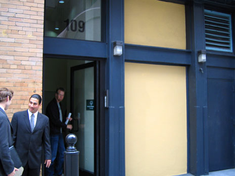
Office shopping
Next in the series of photos used for header images on Stopdesign is a candid photo I never would have expected to make use of in any kind of design, let alone Stopdesign’s Company pages. There’s nothing spectacular about this photo at first glance. Maybe even at second and third glances. In fact, any other designer probably would have passed it over. This… is Office Shopping.