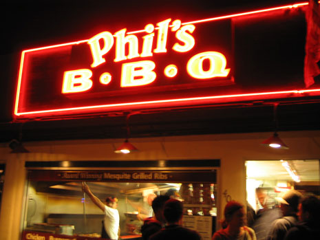
Picking up where we left off a couple weeks ago, I direct your attention to the header for the Examples section. (And no, you’re not just imagining a drastic shift if you looked at it soon after the redesign. I did change the background of the page from dark to light.) The original photo for this header image was taken during a recent trip down to San Diego, where good friends, Jason and Megan, took me to one of the best barbecue spots in the country… Phil’s BBQ:
Posted in Site
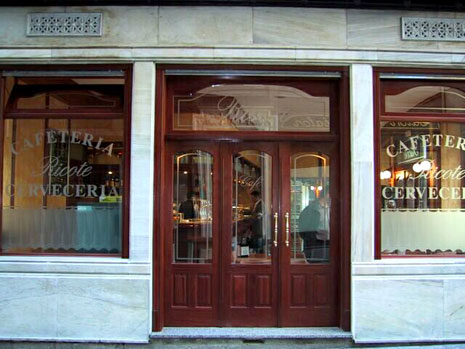
Café en Madrid
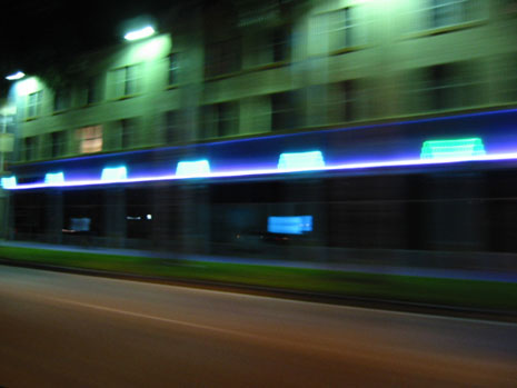
Drive-by shooting
In the first of a series, I present the original, undoctored photo used for one of the header images on Stopdesign. This one: the home page. There’s a story behind each one of them, which will help humanize the abstractions I’ve used for each header. This photo was taken while I was visiting Miami in November 2002 for the AIGA I|O: Interaction Only Conference. I dubbed it… The Drive-By.
Stopdesign, reloaded
Welcome to Phase II of the new Stopdesign. Baby’s got new shoes. As if I weren’t busy enough as it is with current projects. For some reason, two weeks ago, I decided to start a full-blown redesign by yanking my own style sheets, encouraging me to do something sooner, rather than wait for a lighter workload. For those that count, this would be design version 3 (not counting the short-lived lightly styled version this one replaces). continued
More change afoot

Remember what was said about a work-in-progress? Certainly you didn’t think Stopdesign could be left stripped of proper attire for long? Phase II is already well underway…
The cost of Page Rank
The subject is covered frequently in the blogosphere. It’s nothing new for many of you. I’ve been bitten by Stopdesign’s Google page rank for specific search queries several times. I just noticed the most recent instance. When John Gruber published “Writing for Google” earlier this month, he provided advice for getting a good rank for one page or article so those seeking its content are likely to find it. Follow his advice for content you want people to find.
There’s a flip side to this issue though. What happens when Google gives a particular page too high a page rank? continued
Starting over
Ever wanted to ditch what you’ve got and start over? I sure have. I’ve been wanting to completely wipe the style sheets clean for this site and start over with a blank slate. Finally jumped off the cliff. Wonder if anyone saw me do it. And if they did, will they understand why? continued
The return
Ah, that feels comfortable. Like a whirlwind travel adventure to a new place you’ve seen in lots of pictures, but never experienced for yourself, then returning home and being able to slip back into your own comfortable clothes, and collapse in your own bed. There’s a familiarity here with the markup, style, and templates that feels good. continued
Time for change
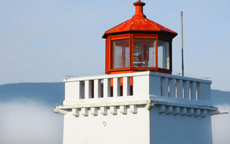
Feeling inspiration from others who’ve been redesigning, I finally decided it’s time to take this site’s design in a slightly new direction. I’ve been working on this one in the background for a while, whenever I’ve had spare time. The colors were inspired by a photo I took of the Brockton Point Lighthouse in Stanley Park while visiting Vancouver last year for the AIGA National Design Conference.
Even the Swedes like it
I’ve seen some approximations that are different enough to write off as pure coincidence. The Stopdesign identity is intended to be strong, bold, and memorable. But I will freely admit it’s a simple concept as old as Chinese Taoist philosophy and the Yin Yang symbol they use to represent harmony and equilibrium in the universe. continued