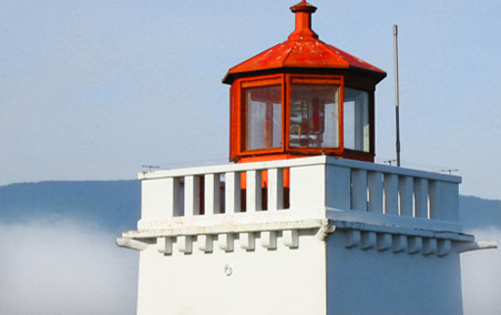
Feeling inspiration from others who’ve been redesigning, I finally decided it’s time to take this site’s design in a slightly new direction. I’ve been working on this one in the background for a while, whenever I’ve had spare time. The colors were inspired by a photo I took of the Brockton Point Lighthouse in Stanley Park while visiting Vancouver last year for the AIGA National Design Conference.
The column structure is basically the same, though I’ve shifted some of the content and navigation around. The redesign is still partially in progress, so bear with me while I continue to update pages throughout the site. All feedback is welcome. Love it? Hate it? Feel free to share your thoughts in the comments for this entry.
Update: The design referred to in this entry is now permanently archived on two static pages: Home page, Entry page.
