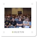
When I finally met Hugh Forrest for the first time in Austin this past week, I told him I keep thinking each year that SXSW is the biggest it can possibly get. That there’s no way the following year can top the previous year in terms of the talent he pulls in for speakers, and the amount of interesting people attending who are so open and receptive to new ideas. Each time I’ve been wrong.
Last year’s thinking and this year’s festival was no exception. As the plans started to come together for this year’s event, it was obvious there were going to be lots of people converging in Austin from all over the globe. Friends from previous years returning again. And people I’ve gotten to know virtually over the past year whom I was looking forward to finally meeting in person.

In last year’s panel on “CSS, the good, the bad, and the ugly,” I went over my alloted time, and had to stop my presentation before getting to the concept of Double Rollovers used for the Adaptive Path partner photos. I’ve used that same technique in several other places since then. Because it can be used for changing more than just two objects on mouseover at a time, I renamed the technique Remote Rollovers. For the first few minutes, I walked through how it works, and reviewed a few examples of its use. A companion article is already in the works which reviews the same examples and provides more detail on implementing the technique.


As the photos show, from my perspective, SXSW is definitely about people. The people who speak and present their ideas, the people who attend, the people who ask provocative questions and challenge the panelists, the people with whom you get to spend an hour or two eating around a large table, discussing everything relevant to our worlds. It was a pleasure to spend time with so many friends this year, and to make acquaintances with quite a few new faces as well. I’m already looking forward to next year. Except that this time, I don’t think I’ll underestimate how big SXSW 2006 might be.

As I have said in other blogs, I am jealous I couldn’t be there.
Sounds like a blast. Maybe next year. Why don’t you all come up to Indianapolis :)
Yeah, definitely sounds like people had a good time and that there was lots of interesting talk happening… I keep getting more disappointed that I missed it all again.
Next year…
This is the first year I’ve heard of SXSW, and it seems like a great conference. Not only because of the awesome talent that present, but because of all the web-geek socializing. Nerds with computers on a semi-vacation, what could be better…
Those are some great photos you took and I love the method with which you present them (always have). Hopefully next year or later, I’ll make it down there. It looks like you had a great time. I look forward to the article in progress. I wonder who will be at next year’s?
Ok, that’s it. You can’t keep me away next year, just try and stop me!
Sounds like everyone had a great time, and great things happen when you fill a room with smart thinkers. Here’s hoping some of the ideas presented at SXSW start showing up on the web and making it a better and even more productive place to be.
I was there last year, but missed this year, which is a great shame indeed. Not only were there some fantastic panels on offer, many of them seem to be follow-ups from the year before. I like the idea of almost year on year developed panels. I for one am interested in seeing how a designer has grown and adapted, but also what they have to say from year to year. I would great if that theme continued into 2006. Already looking forward to it.
I really wish I could have taken time off work to be at SXSW. Perhaps next year. I must say, though, that I anticipate when you post your article on double rollovers. I study your work like a textbook, and this should prove to be yet another illustrious chapter. Thanks so much for what you contribute.
Man, I am missing out! I need to look into going next year…
Eh? I’m so disappointed. I’ve lived in Austin all my life and never heard of any design panels at SXSW. Here in town all we hear about is Music & Movies and the extremely high price of admission, so I’ve never been. This UI Designer is kicking himself at the moment.
I wish I would have taken more photos too. Thanks for posting yours. I figured so many people were taking photos and posting them on flickr and I wouldn’t need to take so many–I will just go to flickr to see them. However, I wish I would have taken more, there is something special about having taken the photo yourself.
It was more than I expected for my first trip. I’m ready for next year. The people were great and the panels were excellent as well. The amount of photos on flickr.com amazes me.
Doug, it was a real pleasure to meet you finally. Sorry about the slagging of American beer, by the end of the week I had found some decent beer at the Bitter End in Austin – so not all bad.
Where is this located exactly? I wish I could go.
Oliver, it’s in Austin, Texas.
Lovely photos, Doug.
If everyone who commented who wanted to go but didn’t does next year (like myself, who actually lives in Austin but was in Houston for the break), then your observation will once again hold true — SXSW will get even bigger.
So for the sake of this theory, we all should go. See you guys there next year? :)
I think I’m going to add this blog post to my running list of bloggers who have posted something about SxSW.
Other than that, it was cool to see Dave Molly and Doug all up there on the same panel.
And Trey, see you there next year too ;)
Doug, are you planning to post your slides from the Hi-Fi CSS Design panel?
Damn, I shouldn’t have been such a wall flower and said hello. Ah, maybe next year…
This is the first year that I’ve heard of SXSW, and suddenly it seems like everyone is talking about it. And I mean EVERYONE; I even heard a live report on Virgin Radio last week!
Man, I wish I could have been there. Hopefully I’ll be there next year.
Can somebody write a susinct list of the top 5 reasons why a web designer should attend SXSW next year? Also, can someone provide a susinct list of the top 5 conferences to go to? While you’re at it, I’ll have a side of fries.
Sounds interesting, I just wondered if there’s something like SXSW in Europe? Anyone knows about an equal conference around here? I haven’t heard of one with that kind of potential.
ulf, check @ media 2005 this year in london. the speakers and the experts staff is just awesome.
Doug,
Thanks for the laugh out loud moment in the Hi-Fi panel when you started with, “I’ll take up where Eric cut me off last year…” and off you went not missing a beat from the intervening 360 some odd days.
smiles, jen ;o)
thx andrei, since london is not inexpensive for a student and I just returned from a trip there in february this won’t be an option for me, I guess. thank you anyways for looking it up.
Sounds like it was a blast, I wish I could have made the trip. Any plans of branching similiar (but smaller) conferences in other countries.
It’s so sad. Another year, another miss. Like I’ve said every year (for the past few), I’ll start saving my money for he trip now.
From an outsider…
After 25 years of programming everything except toasters this site/discussion impresses the hell out of me.
I know that you don’t need any applause – this sffort stands by itself – I have to say that this is great!.
I have used style sheets for more than three years. I always sensed that more was available but never had the time to explore. Now I can play catch-up. Thanks.
I hope in the years to come this approach to rendering content will get more complete support. It is full and nearly complete now but still needs the big guys to wake up.
On the way into the site I saw a little blurb about MSN going CSS. ‘Bout time. Their site has always been one of the poorest performers and kludgiest sites on the net.
Sharepoint is a good product. MSNs rendition is not a good advert for it.
Microsoft has always given lip-service to CSS but never taken it seriously. The issues they have with rendering for different browsers with ASP.NET might be solved by understanding that CSS is to HTML as XSL is to XML.
Keep up the good work – I will definitely study and promote the effort.
Damn, I still regret I couldn’t be there :( However I started preparing the trip there for SXSW06 so I hope it would become real. In the meantime I hope to meet some of these great guys in London in June…
Some time ago you wrote that the gallery style could possibly released after some cleanup. I think this is wonderful and amazing. Any chance for this soon, even not cleaned up code? I have some need soon for a gallery for some events, and your style is the best I found (something nice an simple). Thanks.