In a presentation for @media entitled, Zoom the Web, Joe Clark revealed and explained several possible options (a new trend, hopefully) for making sites more accessible and readable for low-vision users. In the continuing effort to make our sites accessible as possible, many have assumed accessibility best practices deal primarily with blind people who often use screen readers.
In reality, there are many more people who aren’t blind but experience some form of vision loss or impairment. These people would never have need for a screen reader, and wouldn’t necessarily benefit from the typical measures we’ve taken to ensure our pages are accessible to blind people.
To some extent, we’ve been ignoring this large group of low-vision users, assuming their browser controls for resizing text are enough to enable reading of our pages. Or that their own screen magnification software does the job well enough, so we don’t need to bother.
Some designs I’ve seen easily handle quite a few bumps up in text size. Others start to fall apart more quickly than they should because of narrow, fixed-width columns. Many of you probably know how difficult it is to read text when you’re forced to scroll both vertically and horizontally. This can parallel the experience of using a screen magnifier to read most multi-column pages.
Enter the Zoom layout
Another means of giving your visitors control over the content on your website. If a site already takes advantage of CSS for layout, offering a Zoom layout option is trivial.
Case in point: While Joe was giving his presentation in London, I thought, “Implementing a single-column layout with larger sans-serif type isn’t rocket science. Why don’t I already have one? I’ll just create one right now.”
So I opened up my laptop and cranked out a quick style sheet for a Zoom layout. I had it mostly complete by the end of his presentation. I’ll admit that I was already familiar with Joe’s concept, having seen his article, Big, Stark & Chunky, on A List Apart. And I had seen his referenced examples from Cameron Adams and Sergio Villareal. Stopdesign already had a Preferences page for switching styles and font sizes. So I was at a slight advantage when Joe gave us his homework assignment of creating and tweaking our own Zoom layouts.
I’ll save you from any further description of a Zoom layout, and instead, encourage you to read through Joe’s detailed notes from his presentation.
Making it real
Once I got back to the States, I spent time polishing the style sheet I had pulled together in London, and split my work into two versions for Stopdesign’s Zoom layout: a positive version with dark text on a light beige background, and a contrast version using an inverted color scheme of light-color text on a dark blue background.
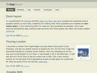
Zoom (positive)
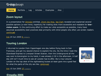
Zoom2 (contrast/inverted)
Both are available as permanent settings on the Preferences page, which appears as the fourth link at the top of this site for any non-Zoom style. (Those first four links actually exist toward the end of the markup, just before the footer.) Base text size can also be changed to one of four values on the same page.
The heavy lifting for both Zoom layouts is done only once (zoom.css). For the high-contrast/inverted color scheme, the background, text, and border colors are changed via a secondary style sheet (zoom2.css) linked in addition to zoom.css.
Users of browsers other than IE will notice a nice scaling effect on the width of the layout as the text size gets bumped up. The single-column is given a max-width in em values, with no physical width defined. This allows the layout to remain confined to readable line-lengths at smaller text sizes. Yet it also allows the layout to expand as text size is increased. The layout will expand to the width of the browser, then stop expanding, preventing the appearance of any horizontal scrollbars — unlike the new Yahoo!, though nice because its layout expands with the text size, it quickly expands beyond the browser window width as text size increases, necessitating all kinds of scrolling.
A few more tips
If you’re considering offering such a layout to your visitors, first, make sure you read through Big, Stark & Chunky and Joe’s presentation notes to understand the purpose and suggestions for creating a Zoom layout. Follow most of his advice, and you’ll be well on your way.
From my own experience, I’ll add a few tips to consider in the process:
- Re-examine your markup: Going to a single-column forces you to take a look at the order of your content within the markup. Try to keep your most important content — and the content which changes from page to page — toward the beginning of the document. Use common sense in determining order.
- Simplify navigation: Too many choices at the top of the page will be confusing, and may push the content completely off-screen when the text is bumped to a larger size. Keep the list as short as possible, and consider making the list
inline, orfloateach navigation element. Do this in a way that it doesn’t look broken if the navigation wraps to more than one line. If long lists of navigation must be present, consider moving them toward the end of the document, then reposition them for your default style in your original style sheet. - Avoid pixels: I’m not talking about type here — Joe covers that in his notes. Don’t use pixel values for width or height measurements of content containers (columns, etc.) And as much as possible, avoid the temptation to use pixel values for any margin/padding and line-height values. Use percentages, or even better, ems, which scale gracefully with the text size, retaining chosen proportions. If appropriate, use pixel values sparingly around fixed objects that won’t be changing in size anyway, such as the logo. You may also want to use a fixed-pixel value for the outer (
body) margin or padding, to avoid those values getting too large as the text size increases. - Remember form elements: Just as you bump up text size in general, don’t forget to do the same for form elements. Not all browsers allow every form element to resize with the text (shame on them), but do your best to make form elements as easy to use as possible for your low-vision users by bumping up their default size as well.
- Good and bad insets: Even though you’re striving to keep all content in a single column, it’s still OK to float the occasional image, as long as said image is not overly wide or tall. As long as text can flow freely around the image, the low-vision user still gets the benefit of seeing the image in context. The image won’t be scaling up preventing the flow of text around itself. That said, insets of text-based (non-image) content can be a bad thing, because that inset text needs to scale too. This can be distracting as different lines of large text compete for attention.
- Start from scratch: If at all possible, wipe out any existing site styles before applying new Zoom styles. In my opinion, it’s much easier to build a single-column design from scratch, rather than needing to go back and make sure you’re overriding all original style sheet values. This requires some server-side scripting to change the default style sheets that are linked or imported in the
<head>of each document, and may not be possible for everyone.
Zoom style sheet availability
You may need to apply a few tweaks for use on your own site, but feel free to grab Stopdesign’s zoom.css file, or both that file and the zoom2.css file to use as a base/starter for your own Zoom layout. Both style sheets are licensed under a Creative Commons Attribution-ShareAlike 2.5 License. Creating a single-column style sheet isn’t difficult, but if these two files give you a jump on the action, be my guest. Cheers.
(It should go without saying, but this does not grant permission to freely copy and use any other Stopdesign style sheets verbatim for any purpose other than studying and learning how they function. Thanks.)
Update: Joe is now building a repository of information about zoom layouts, including links, references, and examples.
Very, very nice. The only suggestion I have, and it has nothing to do with the technique, would be to present the low-vision option in a more obvious fashion than the other preferences though. The other prefs are arguably “non-essential” and do things like tweak the theme to a user’s liking, but it would seem to me that if a user came to your site with extremely poor vision, they’d be much more likely to use your low-vision styles if they saw a link at the top which was labeled “low-vision?” or “readability”. “Prefs” seems too subtle to grab the intended audience quickly.
I think this is a very good technique! Thanks Douglas :)
Good point, Mike. Something I’ve thought about, but I haven’t exactly figured out what to do about it yet.
It’s also one of the questions Joe asks in his presentation:
First, on your normal default homepage, which is going to be too small and cluttered for a low-vision person, how and where do you indicate that a zoom layout is available?
If you’re alright with using a bit of non-standard CSS, IE supports a
zoomproperty that’ll increase the size of everything in a given element, not just the text.It could a quick-and-dirty way of letting users increase the size of text etc. by clicking on a button multiple times, until they feel comfortable with the text size. Obviously it isn’t the best way of doing that, though.
GREAT write-up Doug!!! I will have to do some testing on this myself in the near future as I have a wide variety for an audience. I write web pages and apps for hospitals (I work for McKesson) so there is a HUGE need for me to take these techniques into account for redesigns and future pages/apps.
One additional hint: when you do a zoom layout, make all the text flush left and do not center or right-align. In tests I’ve observed Users with magnifiers started at the top left of a page, then went down the page in zigzags. Now if there wasn’t anything on the left at the beginning of a line they would go further down, missing all the content that was further to the right. You can put any additional niceties (like you did with the images) there, as long as they’re non-essentials, but anything else has to be one-column flush left, I’m afraid.
Well, nice thoughts about bringing “it” to nearly everybody. I have a friend at university with a slightly vision-disability (slight, but taking adavantage of this technique). I asked him the favour to check these 2 versions and he was quite enthusiastic about the positive version. The contrast one is (to him) a bit too much. He is able to read most of the text, but navigating especially at the top of the page isn’t that easy. I underline the “to him”. Regarding other people it may be quite the way round – that’s for sure. I just wanted to add this in order to make my point, that it’ll take us a while until “everyone” will be able to enjoy (at least the content) as we do.
There seems to be a contrast problem in both when you hover over a link with a code tag (eg. the links to the zoom.css). Otherwise, very nice work!
Oh, nice article there.
I was hoping after atMedia someone would do something like this. I will definately be having a look at how you put yours together.
I am developing a site that will have low vision options available. before I went to atMedia I was just going to provide a larger font version and a black/yellow version. But now Joe talks about the zoom layout, should this replace my other versions? ie the black/yellow and larger fonts? Surely it would make sense to just have a zoom layout in black/yellow…?
Very nicely done, Doug. I absolutely love the fact that there is no horizontal scrolling in your zoom layouts. Plus, as an added bonus, your navigation text doesn’t expand out of its box–a problem that I currently have on my site and have seen on many others. Thanks for another great tip!
Doug, what I love about your Zoom layout is that its a beautiful style in its own right. They don’t feel like a clunky, but accessible ‘poor-relation’. Nice work.
I really should make some time to do something like this!
I’d just like to point out an article on my site called ‘Floppy Design’, its flexible width and scalable too.
http://thewolf.dotgeek.org/?p=5
Good advice mind you :)
I’m what you might call a low vision user. Because of a congential eye condition, my corrected vision is 20/70. So, I’m always using the Universal Access “Zoom” feature in OSX when I use my iBook. In fact, I’m partial to Macs largely because of Apple’s committment to accessibility.
I rarely use Safari’s built in Zoom under View>Make Text Bigger because I like to see web pages the way the author/designer intended them to be seen. And if I do use Safari’s Zoom, it’s in combination with the OSX UA zoom so I don’t have to distort the web page’s appearance too much by blowing up Safari’s font size.
I love your beige and your high-contrast zoom layout. I can read it easily without having to struggle. And I like the clean, minimalist look you’ve employed. The high-contrast is easier to read, of course.
I hope more designers take this zoom layout concept to heart. Everyone isn’t lucky enough to have 20/20.
Zoom layout looks pretty much like what I have on my personal web site. So I guess if you want another example you could look at mine.
In case you don’t notice, there is an image on my home page that resize with the left-column. I have documented how I ensured it look good at all sizes. Maybe this could be of some value if you are making a site using a zoom layout.
I just had an idea while creating my own low vision-layout. Try to hover over an acronym to see its definition and you will notice the box that appears uses a very small font that obviously cannot be read by low-vision users. Now, I came up with this piece of code (good-browser only, though) that removes the problem:
acronym:after
{
content: ‘ (‘ attr(title) ‘)’;
}
Just changed my fonts on my blog to ems instead of px and I feld a bit relieved… but now after seeing your Zoom lay-out it’s starting itching again, it just looks too nice ;-) Very inspiring and motivating (AGAIN!). Damn you :-P
whilst the zoom layout looks very good, and I agree with the concept, I still think there is a problem in that most people wont ever get to it. My experience is that people use a site in the layout they find it in and that’s it. Well for the most part.
I would be interested to see your stats in a few months to see how many people are actually using the zoom layouts.
Creating a zoom layout is easy. Creating a mechanism that allows the people who need it, find it and turn it on easily is more difficult. What you need is a button on the browser (all browsers, every browser) called Zoom or something. Where if a site has a alternative style sheet of type zoom, the button enables and users can just click that. Or something.
I really like the look of your zoom layout. Once again you’ve done a wonderful job.
Could you remove the indent for comments? I’m reading this page on a Treo 650 and the comments start about 40% from the left of the screen. Actually it would be nice to have a handheld style sheet that would turn off or minimize the body margins.
Thank you for adding beauty to a zoom layout.
I love the idea of allowing user options. My only concern is the understanding of zoom software. A typical user who uses zoomtext goes far beyond the ability of what is built into stylesheets. The magnification zooms the entire screen not just the text. This can really fragment all fonts, no matter their size.
What a fantastic article to kick off my lunchtime blog surf. I found it very easy to use – nice to find the controls in a consistent location too. And pretty too! It’s all to easy to not bother with further styling as soon as you find yourself in accessibility mode which is rather a shame.
Adrian has a good point to drawing attention to the problem of highlighting the fact that a zoom layout is available but I’ll be interested in seeing how we tackle the problem in the meantime by labelling the option in the web site. I’m leaning towards developing an “accessibility” menu at the very top of a website that I can use across projects and will be googling for best practice labels if they’re out there already.
I’ve also begun a zoom layout for a web site: http://www.alcalapetcare.com. it needs to be chosen from the file menu and I haven’t made it persistent yet. I still need to make a few changes.
A brief description of it: http://www.tdrake.net
However, the notification of zoom layout on the normal version is still a tough call. This particular web site doesn’t seem to have a place near the top for a nice button. I considered creating a little icon of mr. magoo style glasses with hover that could represent low vision.
But they would look awkward on this site’s circa 1915 Paris style.
Ted
I read this article early this morning, and I’ve decided to add a stylesheet to the redesign I’m doing for http://www.uwplatt.edu to include low vision people. I was even spurred to write a haiku about it:
make those icons big
people with bad eyes can’t see
you silly monkey
I never claimed to be a poet.
We’ve just implemented a similar zoom to yahoo! on our new site (still in development) but am currently building a stylesheet switcher for a fixed width version as well, as those scrollbars can be a pain at 800×600. I do like your idea of adding a max-width property.
i used the following tutorial to implement a working and uncomplicated style switcher on my site
tutorial: http://www.centerkey.com/style/switcher/
my site:
http://www.ebauche.net
i have slightly altered the way the tutorial suggested to enable xhtml compatibility. This way i found was perfect for allowing someone to see that there is an option to increase the text(site) size.
and i’m totally sold on ems being used for as many measurements as possible.
This is the first time i’ve implemented this, but it certainly seems to work well (if someone has safari could they let me know if it breaks in that?)
Was this website’s text enlarged?
I mean, was the default text size preference set to LARGE ?
Gustavo – The user has the option of changing the default font size on the Preferences page. The only adjustment in size I made for both zoom layouts was to size text up from the default by 110%, and I avoided dropping it down by 85% like I do for the other styles.
Great zoom layout Doug! There is a real effort towards simplification and prioritization (what?), which I think require the most work.
I have one remark though, but it is a bit far reaching (I couldn’t really find anything to criticize): both zoom layouts should make you switch to large or extra large text…
I have made a zoom layout for my site, although my site is fairly simpler and I just went for big text and inverted, high-contrast colors.
The (homemade) style-switcher however is more complex because it also allows for normal control over the stylesheets (via the UA interface) which I think is quite important (although I don’t know why).
PS: Is there something non utf-8 in your comments loop? When I previewed my comment, the name field became SÃƎbastien Guillon, upon second prview it was further munged (logically) to SÃƎbastien Guillon, and so on. I had to modify the name before submitting.
We will be using one of these on our website – we actually have an accesibility section in our main navigation in which we (well I) plan to have our style switcher in.
In regards to making this stand out and visible to those using the site (and equally those who may require its functions) I have been thinking of a few ‘sneeky tricks’ that may just be awful but thought I would sound it out, see how it gets shot down!
One of the things that I took as the main point of Joe’s talk was the fact that most layouts used today on the web (those with columns!) will eventually break as people bump up the text sizes – therefore meaning that people WILL do it regardless of what we provide them….
…..but what if we provide them pages that won’t allow them into doing this and therefore make them use the zoom layouts, say we use pixel values for all apart from the links that lead to the accessibility sections or zoom layout links and therefore give them an emphasis over all else on the page; people may them decide to start using the zoom layouts we make and stop bumping up their browser sizes unitl our web pages break!!
I am sure this breaks every law of accessibility out there but its a Friday and my mind is starting to think of the weekend and I feel like a debate!
Any comments on this would be great :>
What I love about this zoom layout is it isn’t just something thrown together, it looks like it was designed gracefully, and still above all looks nice. Sinc I browse the web on +1 text size all the time anyway I’ll be using the contrast version all the time, it doesn’t take away from the feel :)
Hmmm… I just wondered why you wouldn’t scale your stopdesign-logo too?
When I look at the site in a large version, the logo seems to be inapproriate small. Couldn’t you try to display different sized logos for different zooms?
Adrian has a good point to drawing attention to the problem of highlighting the fact that a zoom layout is available but I’ll be interested in seeing how we tackle the problem in the meantime by labelling the option in the web site. I’m leaning towards developing an “accessibility” menu at the very top of a website that I can use across projects and will be googling for best practice labels if they’re out there already.
While we are talking about ‘accessibility’ you could start with accesskeys in your menu. And maybe a standard ‘z’ could be set as a standard for those people looking for the zoom view button/link.
Althoug I still believe every webdesigner should layout a website that allows for a fair bit of zoomability, standard. (ctrl-mousewheel)
Nice article
I tried creating a zoom layout recently (I like to call it Flexible Layout), all went well with my
emsized layout until I realised that the faux column I used to make opposite columns with different background colours/borders appear the same height was misaligning when I scaled the text/layout.Any ideas on how to faux this?