Archive

Recent entries

A love letter to Twitter

Since its inception, our generation has struggled to pin down an answer to the question, “What is Twitter?” I’ve seen attempts at describing Twitter as microblogging, a messaging platform, a broadcasting tool, a social network, an information network, an interest graph, and real-time communication. Twitter, itself, has used phrases such as, “the world in your pocket,” and more recently, “a global town square.”

That it hasn’t (yet) been holistically and easily describable in a single phrase is part of the beauty of Twitter to me. It does so many things for so many people. Whatever adjective or metaphor used, I think of Twitter as a service. Because that’s how I’ve always seen it. It’s a service driven by the people and operated for the people. And it is literally in service to people around the globe.

Twitter is people-powered. It has always been about people. The way people connect to each other, they way they converse and interact, what people share, what they’re doing, what they’re thinking… and what they love. Twitter is unique and wonderful not because of the service itself, but because of the people who use it, and how they use it. continued
Growing Twitter Design

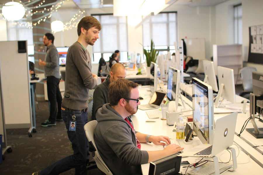
First, the whole point of this post. We’re expanding the Twitter Design Studio. Whether you’ve ever thought about working at Twitter or not, think about it now. We have a few open spots that we’re looking to fill in the next couple months. One of the desks in this photo of our studio could be yours. If we run out of space, we’ll make room for you.


Critiquing by @design

What we’ve been up to

We post samples of recent work on our Dribbble account. We’ve started posting photos of the studio and the team on 500px. (Some are embedded here in this post.) And, of course, we tweet too, from our team account, and all our personal accounts. Want to know more? Ask me or anyone on the team anytime. Here’s a tip: the service on which we all work makes us all easily contactable. We’re a pretty open bunch, and we’ll answer any questions as openly and honestly as we can. continued

Wired.com: Ten years later

Ten years ago today, we pulled back the curtains on a redesign of Wired.com. The actual design and the code that rendered it are long gone. But they were significant in their time.

The redesign of Wired News in 2002 marked the first time a large, well-known, daily-content publisher had dropped tables for layout, and embraced the separation of markup and style in a rather new (at the time) approach to web design. Several prominent blogs, and niche content sites (zeldman.com, meyerweb.com, alistapart.com) had broken ground, and were already using and evangelizing a greater adoption of Web Standards.

continued

Theme files for my WP tweet archive

Last month, I posted a short little write-up about how I created my own tweet archive. It was a quick hack, pulled together one Saturday afternoon, and fairly incomplete, at best. But the archive serves its simple purpose every now and then. I intended to update the archive, add some features, and modify the theme files to better prep them for distribution. But I’m realizing I probably won’t get around to that any time soon.

I’m seeing lots of other folks building out their own archive. And lots of them are using the WordPress solution I wrote about. So in the interest of providing a rough starting point, I’m making the WP theme files for my tweet archive available here (under a CC license) for anyone who wants them as a base. Download tweets.zip (39 KB).

One followup note… Andy Graulund (@graulund) is building a similar tweet archive that is much more robust and more awesome than my original. His is a PHP-based solution (no WordPress required) with embedded media, permalinks back to Twitter, graphs showing tweet activity, and more. I believe he’s planning on releasing his source soon. Keep an eye out for that.

WordPress-based browsable, searchable archive of tweets by Douglas Bowman is licensed under a Creative Commons Attribution 3.0 Unported License.

Hello, Twitter, one year later

A year ago, today, I joined a small startup with a penchant for brevity. Many of my friends were using it. My mom had only heard mentions of it. I noted some risk, but saw greater reward. Variables were undefined. The product was still in its infancy. But potential was everywhere.

One year later, I’m just as eager and excited to head into work today as I was then. More so. Because I know even more about this growing company, the amazing people who work for it, the humbling principles under which it operates, and the myriad of purpose it serves. I’m thrilled with what we’ve accomplished in Design, and with the designers we’ve hired to do the accomplishing. We’ve pushed out some “good” and a fair amount of “awesome” so far. But we still have much work to do.

It’s cliché, but still true. Time flies when you’re having fun. And what fun we’ve been having. Here’s to looking back at a fantastic year, and forward to another that puts last year to shame.

A browsable, searchable archive of tweets

In the past, I’ve wanted to browse or search through my own tweets. Viewing my Twitter profile is one way to do that. But if I want to browse back through history, it’s a chore to go back very far. And forget about searching through my own tweets on Twitter since Twitter Search currently only goes back about a seven days.

I know there are a few apps or scripts that create backups and much more for you. But I wanted a database and simple UI completely within my own control. One that wouldn’t go away if the developer abandoned it. So one Saturday a few weeks ago, in a little over an hour, I had my own, free, browsable, searchable tweet archive. Now I can easily browse back to my very first tweet, or search for those quotes by Paul Rand I tweeted last year. This isn’t anything entirely new. I’m just writing it up what works for me in case it helps fit some pieces together. continued

Apple notebook packaging comparison

Interesting comparison (my own) of packaging for Apple notebooks. I’ve been noticing a trend over the last few years to cut way down on box size for both hardware and software. But I still think it’s interesting to see side-by-side comparisons for similar items over time. This first photo shows the original box for a 12" PowerBook G4 purchased in 2004 (black box) next to the box for the current generation 15" MacBook Pro (white box) purchased in 2009.

Another similar photo compares packaging for the 12" iBook purchased in 2006 next to the box for the current 13" white MacBook purchased in 2009.

In both cases, the newer notebook is larger than the older notebook, yet still uses a much smaller box.

After recent Unboxings™ of the MB and MBP, I noted there’s no less “stuff” in the box as far as hardware, adapters, install discs, and printed material. The new packaging designs just forgo the thick molded styrofoam padding of the old boxes.

Hello, Twitter

Part 2 of 2 (here’s Part 1)

Yesterday was my first day at Twitter.

Yes, it’s true. After reading a bit of speculation over the past few weeks, I’ll confirm here that I am, indeed, joining Twitter. I don’t remember ever being as eager or excited to start a new job as I’ve been with this one. (Thus, why I only took one week off between jobs.) continued

Goodbye, Google

Part 1 of 2 (here’s Part 2)

Today is my last day at Google.

I started working in-house at Google almost three years ago. I built a team from scratch. I was fortunate to hire a team of a very talented designers. We introduced Visual Design as a discipline to Google. And we produced amazing work together. I’m very proud of my team, and I wish them well. They have a lot of challenging work ahead. But for me, it’s time to move on. continued

All items

sorted by date or by title370