Posted in Apple

Better Screen, Same Typography

Khoi Vinh on Apple’s lack of full commitment to excellent typography, despite creating oft-superior devices seemingly capable of perfection:

Steve Jobs’ vision for Apple, repeated in yesterday’s keynote address, posits that the company operates at the intersection between technology and the liberal arts. I think it’s reasonable to regard fine typography as falling within that mandate, but unfortunately, they are falling short of that promise. Building a great display for typography without building great typographic tools is a dereliction of duty.

Apple notebook packaging comparison

Interesting comparison (my own) of packaging for Apple notebooks. I’ve been noticing a trend over the last few years to cut way down on box size for both hardware and software. But I still think it’s interesting to see side-by-side comparisons for similar items over time. This first photo shows the original box for a 12" PowerBook G4 purchased in 2004 (black box) next to the box for the current generation 15" MacBook Pro (white box) purchased in 2009.

Another similar photo compares packaging for the 12" iBook purchased in 2006 next to the box for the current 13" white MacBook purchased in 2009.

In both cases, the newer notebook is larger than the older notebook, yet still uses a much smaller box.

After recent Unboxings™ of the MB and MBP, I noted there’s no less “stuff” in the box as far as hardware, adapters, install discs, and printed material. The new packaging designs just forgo the thick molded styrofoam padding of the old boxes.

On the Flickr support in iPhoto ’09

Fraser Speirs, developer behind FlickrExport (iPhoto plugin software that I use) dives into the details and simplified — or crippled, depending on your view — functionality of Flickr integration in Apple’s iPhoto ’09. I may have discovered this on my own after using it, but it’s nice to see some of the differences I should note before I try iPhoto’s Flickr syncing. Sure, Fraser has a biased view. But FlickrExport seems to be a way better option for exporting photos to Flickr from iPhoto or Aperature. That is, at least, if you want more control over how, and to whom, photos appear on Flickr. (via Daring Fireball)

Symbolic Java

In sorting through the 980 (!) photos I took in Australia and New Zealand last month, I thought this particular image was worthy of posting here separately from all the others. The Kiwis I met at the conference in Sydney told me Wellington had some of the best coffee in the world. After noticing something in my last “flat white” at the Wellington Airport, I think I understand why that might be true… continued

Drag-scrolling in Safari

[The Saft icon, a flat-screen iMac showing the Safari logo on its screen] Saft is a Safari plugin that allows true full-screen browsing, kiosk mode, and type-ahead searching familiar to the Mozilla family. I gave Saft a whirl after reading a glowing review from Jon Hicks about a month ago. I’m quickly realizing the full-screen mode of Saft is handy when giving HTML/CSS-based presentations. I’ve been using Firefox and a fullscreen bookmarklet for my presentations, but some of the browser chrome and the menu bar still show when using that method. With Saft’s full-screen mode, the only piece of the browser still visible is the scroll bar, and that’s only if it’s needed. continued

HP + Apple

This is interesting. HP and Apple are joining forces to create an HP-branded digital music player based on Apple’s iPodâ„¢. The device will be due out this summer. I had mixed reactions upon first seeing the news. My immediate thoughts went back to the Mac clones of 7 or 8 years ago. But I’m assuming Apple and Jobs know what they’re doing by OEMing the device for another brand powerhouse.

It certainly seems this could continue the increase in exposure of Apple’s hardware and software. According to the release:

As part of the alliance, HP consumer PCs and notebooks will come preinstalled with Apple’s iTunes® jukebox software and an easy-reference desktop icon to point consumers directly to the iTunes Music Store, ensuring a simple, seamless music experience.

If nothing else, it’s an interesting experiment while Apple is enjoying the market leader position in the digital music player space. Will Apple benefit in the long run? Who knows? But it’s a brave step either way.

Mini? Really?

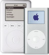
I know there’s been lots of talk about the new iPod mini Apple introduced yesterday. Price-point aside for a minute while I focus on marketing/branding: Is it just me? If we’re speaking in relative terms, shouldn’t the name of this new device be iPod Slightly Smallerâ„¢? Ok, so it doesn’t have the same ring as Apple’s dubbing. But let’s be honest. There’s not much difference in physical size between the new mini and the full-size iPods. The problem everyone is decrying: not much difference in cost either. continued

SwitchBack

Remember that confession I wrote a while ago? A sobering story of a designer who grew up on Apples and Macs, but gave into the dark side, jumped ship, and began using Windows. Well, it’s coming up on a year since I wrote that piece. Some of my friends were beginning to wonder if I was serious about shaking the Windows addiction. continued

Quark delivers for Apple

In January of 2002, Quark dumbfounded Mac design professionals by releasing QuarkXPress 5 sans support for Mac OS X. Because of Quark’s rush to release an already outdated product, Mac-based print designers have either held back in upgrading from OS 9 to OS X, or have bumbled along, forced to run QuarkXPress in Classic mode, or directly within OS 9. Since I continue to accept print design projects, like Jeff Veen’s latest book, Quark’s incompetence has been one of the reasons I’ve avoided switching back to Mac and to OS X. continued

All about the brand

Leander continues the Wired News Mac loyalty series with two more articles pushed out today. Both deal with the power of brand. Apple: It’s All About the Brand makes the point that Apple is not necessarily selling product as much as they’re selling and capitalizing on an emotional brand. A great real-world example and representation of user-centered design:

“Apple’s design is people-driven.”

For Mac Users, It Takes a Village presents the concept of brand communities. The connection between customers allows Apple a little more leeway to experiment and even make mistakes without the threat of mass reduction in user base.

They are real communities, bound by a brand, that display three central characteristics of all communities: a shared consciousness, a set of rituals and traditions, and a sense of moral responsibility…