As I sit at a gate at SFO, waiting for a hop down to LAX where I catch the Time Travel Express to Sydney, the fact that I’m leaving for a whole month doesn’t seem quite real yet. It’s a strange feeling. No anxiety or stress, but an odd feeling that I’m not prepared to be traveling for a month. Sort of like those dreams where you show up to school or some public place, then realize you’re wearing nothing but underwear. continued
Web Essentials approaches
My goodness, it’s only a little over a week until Web Essentials 04 kicks off. How does time go by so quickly? This looks to be (easily) the largest web standards event in the southern hemisphere this year. John Allsopp wrote me last week, informing me they’ve got loads of attendees coming from all over Australia, New Zealand, and even Japan. continued
Flavor saver
With the return of the full-color, fixed-width design to this site over the weekend, Stopdesign received numerous messages and even a few comments regarding the switch back. Some of the messages and comments are in favor, heralding the welcome return. Others cry foul as their Bleach is stolen away.
“More power to the people!”
… the crowds shout from all around. And just like that, their wish was granted. continued
Liquid Bleach
Time traveling
One of the concepts that’s had my brain wrapped around a pole lately is the international date line. When working out times and flights to Sydney recently, I found it really difficult to calculate arrival times based on a 14-hour flight, a 17-hour time difference, and the fact that I was going to cross the date line and lose a day. continued
Australia – New Zealand advice
In less than one month now, I board a plane bound for Sydney, Australia. As I’ve mentioned here once before, I’m honored to be speaking this year at Web Essentials 04. The first annual conference on web standards will be held at the University of Technology, Sydney. I’ll be sharing the stage with Dave Shea, Joe Clark, John Allsopp, Russ Weakley, and geez, a whole host of Australian natives who I can’t wait to meet. continued
Introducing Bleached
Ever wanted to ditch what you’ve got and start over? No, wait a minute. This sounds like a broken record.
Ahem. Let’s try that again.
Ever wondered what your site would look like devoid of most of its color and imagery? Bleach the entire design, remove the saturation and leave behind the basic visual structure on a stark white background? Sure, some sites already use a white background for their design. But Stopdesign has been filled with deep colors and prominent header images since I launched this design a few months ago. continued
Microsoft advances
Seen the Microsoft home page recently? Some remnants of the previous design are still visible, but a large portion of the design changed significantly. The most pleasing thing to see is actually what’s under the hood though.
A huge drop in the number of tables used to lay out the page (my count is seven tables — that’s down from 40 tables previously), not a spacer gif in sight, all the proprietary attributes and identifiers in the links are gone, most of the bulky JavaScript the previous home page used is stripped out, and the HTML now weighs in at a lean 11 KB. continued
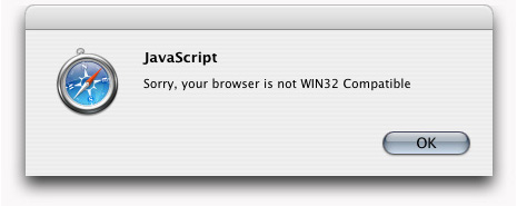
Not WIN32 compatible
While using Safari to browse from one random Blogger blog to another yesterday, I encountered this rather humorous (to me) JavaScript alert message before loading someone’s customized blog template:
New Blogger navbar
While stationed in Washington, D.C., enjoying Adaptive Path’s User Experience Week, I’ll point out another project in which Stopdesign played a small role. Google recently launched another new feature for hosted-blogs that further improves the design and experience for Blogger’s users and all of their readers. In a bold move that meets a long-standing request by many of its users, Google recently removed the awkward ads on Blogspot-hosted blogs. In the ad’s place, a new, much slimmer navigation bar gets tucked into the top of the browser window, adding functionality to each blog continued
