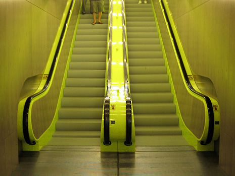
My favorite photo from a 10-minute visit (that’s all the time I had) to Seattle’s Rem Koolhaas-designed Central Library:
Posted in Design
Women, part II
Interesting that the same topic I wrote about at the end of last year (Who/Where are the Women?) is resurfacing. Well, actually, it’s always a topic, but one that seems to be getting hot again continued
Stopdesign, reloaded
Welcome to Phase II of the new Stopdesign. Baby’s got new shoes. As if I weren’t busy enough as it is with current projects. For some reason, two weeks ago, I decided to start a full-blown redesign by yanking my own style sheets, encouraging me to do something sooner, rather than wait for a lighter workload. For those that count, this would be design version 3 (not counting the short-lived lightly styled version this one replaces). continued
More change afoot
Remember what was said about a work-in-progress? Certainly you didn’t think Stopdesign could be left stripped of proper attire for long? Phase II is already well underway…
Starting over
Ever wanted to ditch what you’ve got and start over? I sure have. I’ve been wanting to completely wipe the style sheets clean for this site and start over with a blank slate. Finally jumped off the cliff. Wonder if anyone saw me do it. And if they did, will they understand why? continued
Underline text in Adobe Illustrator
Last week, when I announced the Blogger redesign, I mentioned that I’ve been using Adobe Illustrator much more often to comp my designs, instead of Photoshop. The vector-based Illustrator provides more flexibility in shape rendering, and allows me to create and tweak designs faster than the bitmap editing of Photoshop. Once we’ve honed in on a final design, then I move over to Photoshop for a final polish and pixel-level precision for the site’s images. continued
The new Blogger

The return
Ah, that feels comfortable. Like a whirlwind travel adventure to a new place you’ve seen in lots of pictures, but never experienced for yourself, then returning home and being able to slip back into your own comfortable clothes, and collapse in your own bed. There’s a familiarity here with the markup, style, and templates that feels good. continued
Time for change
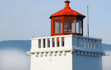
Feeling inspiration from others who’ve been redesigning, I finally decided it’s time to take this site’s design in a slightly new direction. I’ve been working on this one in the background for a while, whenever I’ve had spare time. The colors were inspired by a photo I took of the Brockton Point Lighthouse in Stanley Park while visiting Vancouver last year for the AIGA National Design Conference.
Even the Swedes like it
I’ve seen some approximations that are different enough to write off as pure coincidence. The Stopdesign identity is intended to be strong, bold, and memorable. But I will freely admit it’s a simple concept as old as Chinese Taoist philosophy and the Yin Yang symbol they use to represent harmony and equilibrium in the universe. continued


