My colleagues in Boston ran some users through the Wired News design prototypes this week. While we were fairly confident that many of the usability problems of the old design had been addressed, we wanted to make sure there weren’t any glaring errors that we hadn’t addressed yet. We wanted a test a competitor at the same time to help give us a comparison, so users were asked to run through the same tasks on C|net’s News.com. continued
Relative URIs within CSS
We made an important discovery today which will help us simplify the maintenance and version control of the style sheets for Wired News. It has to do with importing additional CSS files and referencing images from within any CSS file. Since I’m the original and final author of the CSS files, I like to keep a local working version of the design prototypes on my laptop. I was originally referencing URIs in the CSS using absolute paths, relative to the web server root — ie: url("/wired/images/logo.gif"). For the live site, we’ll be hosting both images and CSS files on Akamai servers, which obviously means I won’t be able to keep the same URI references in each of the CSS files. continued
Labor Day break
I’m in San Diego for the extended weekend, spending time with good friends, trying not to labor too much. We spent some time last night enjoying phenomenal Italian food at one of our favorite Point Loma restaurants, Old Venice. I’d highly recommend a nice dinner there if you ever happen to be in the area. Ask for a table out back on their wonderful patio if the weather is cooperating. continued
Tiny screens
Since I haven’t jumped onto the wireless platform bandwagon yet, designing pages for the AvantGo channel has been an interesting challenge. Not too difficult, because there aren’t many choices. But that’s the challenge of it. It’s like trying to say as much as you can with as few words as possible. continued
News on the go
I took a look at some pages today that Wired News generates for our AvantGo channel. The AvantGo reader only supports a limited subset of html 3.2 tags, according to their style guide for developers. After reading though their guidelines, I tackled rewriting and applying a simple redesign of these pages. continued
Credit where it's due
It’s worthwhile mentioning that a lot of the initial research on multi-column CSS layout for the Wired News redesign was done while studying examples from Eric Costello’s CSS Layout Techniques at glish.com, as well as Rob Chandanais’ Layout Reservoir at bluerobot.com. I started by relying on CSS2’s float property to position boxes next to each other. I ended up switching to absolute positioning for the left and right columns. The switch was made for two reasons:
- Buggy browser implementations of
float— Use offloatstill seems to be inconsistent in some browsers. This is especially true when dealing with widths of children that, when totalled, come close to their parent’s width. The problem with float is that if the width of the parent element is ever less than the total combined width of the child elements, even just so slightly, one of the floated boxes will actually get pushed to the bottom of another floated box, instead of appearing beside it. This is actually correct behavior according to the CSS specification. However, when one of the columns bounces back and forth between two entirely different positions as the browser is being resized, it appears to be buggy behavior. Use of absolute positioning avoids that problem. But it does introduce another issue, where the columns can end up overlapping at extremely small browser window widths. A sacrifice I’m willing to live with for a guarantee that all 3 columns will always start at the same vertical position. - Order of data in the markup — To avoid multiple headaches dealing with the inconsistencies of older/smaller browsers, I’m using the
@importdirective to hide styles from browsers which can’t adequately render them. For Wired News, I wanted the center (Main) column, containing the most important content, to be rendered first in the HTML markup, followed by the Left and Right columns. This would ensure the Main column is rendered first in browsers that get the unstyled content. With thefloatapproach, either the left or right column would always have to come first.
Contact made
I sent a note yesterday to Eric Meyer (considered the expert on CSS, and author of many of the books I’ve been referencing about the subject) and to Jeffrey Zeldman (co-founder of The Web Standards Project and creative director of A List Apart). It was a long message, and I mean, long. The purpose of the message was to let them know in advance what we’re doing with the Wired News redesign I mentioned here yesterday, and to guage their interest in knowing and seeing more. continued
News worth noting
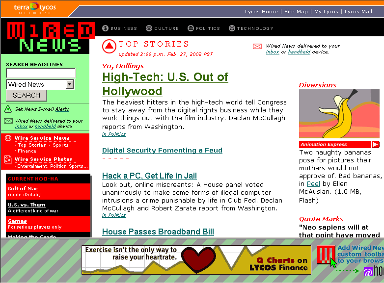
I should mention here one of the major reasons I’ve become obsessed with Web standards and CSS. My current project (as Design Director of Wired) is a complete redesign of Wired News. See a screenshot of the before state [.gif, 35.7 KB] from Feb. 2002. This WN has been sorely stagnate for over two years, and has been long overdue for a major facelift. Wired News has finally gained a priority status from Lycos, which means they can actually justify assigning me as a resource for the redesign. continued
Craving more style
Duly noted that the second broadcast for Leno has already begun on NBC means I didn’t even beat Carson and his Last Call to bed tonight.
 Eric Meyer’s latest book, Eric Meyer on CSS, Mastering the Language of Web Design, just arrived from Amazon yesterday. I’ve already skimmed through the first three chapters. Although it seems I’ve already gleaned much of this information elsewhere, I’ve still learned new tricks or concepts in the first few projects. Eric’s familiar and easy to understand style of writing make this an enjoyable project-based book to work through. continued
Something new
It’s with great humility that I hammer out this first post. Humility, because I enter the game way after many others. Humility because others have been practicing and polishing their writing on a daily — or somewhat daily — basis for x years times 365 days. The sheer size and breadth of some of their blogs makes me feel like I’m sitting down at a table full of experienced high rollers with only $5 of tokens in my pocket. I’ve delayed and procrastinated the start of a blog mostly because I’ve wondered if I really have enough thoughts that pass through my head and are worth writing down. Or if the quality of what I wrote would actually merit taking up a few more bytes of server space somewhere in Miami. continued
About the author
Designer, advisor, father. Former creative director at Twitter. Previously led design teams at Google, Stopdesign, and Wired. Disney geek. Giants fan.